
by Kalev Leetaru
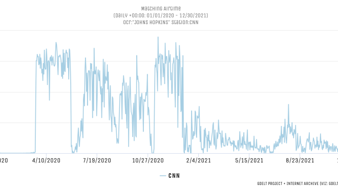
Since March 20, 2020, CNN has displayed a live COVID-19 dashboard in the upper-right of its daily news programming tracking the latest pandemic numbers, including infection and death counts, as seen in the image below.

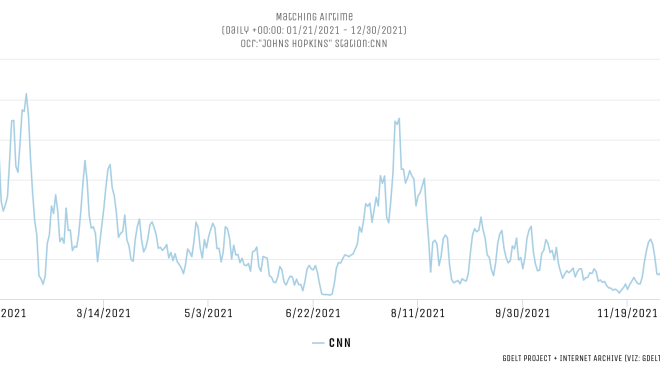
The timeline below records the total seconds of airtime each day since the start of last year in which this dashboard was visible, tracking its ebbs and flows. With the start of 2021, CNN largely phased out its dashboard, bringing it briefly back during the spread of the Delta variant and again with Omicron, but since December 23, 2021 has begun winding down its dashboard once again.
Looking just since the start of this year, despite Omicron’s greatly higher infection rates compared with Delta, CNN aired it much more briefly than it did during Delta’s spread, rapidly phasing it in over the course of a week and just as rapidly has been winding it down, compared with the month-long ramp up it used for Delta.
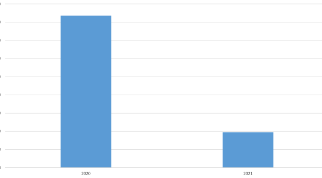
Comparing the total hours in which CNN displayed its dashboard in 2020 and 2021, in the first year of the pandemic it was visible for more than 1,674 hours compared with just 388 hours in the second year.
– – –
Kalev Leetaru is the RealClear Media Fellow, whose areas of research include trends in news coverage, fact-checking, and social media platforms. Founder of the GDELT Project, Leetaru has been at the forefront of reimagining how we understand our world through some of largest datasets and computing platforms on the planet.
Photo “CNN Headquarters, New York” by Billy Hathorn CC BY-SA 3.0.